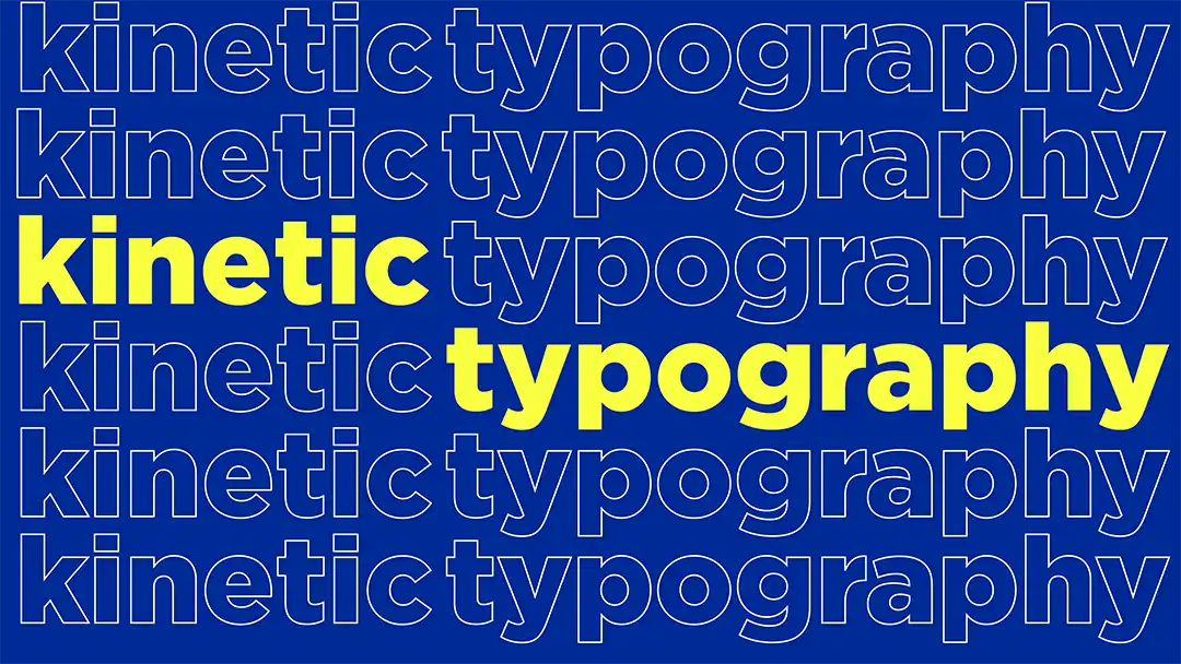
Designing for Attention in the Age of Scroll
Attention Design
Digital Creative Strategy
Feed-First Creative

Carlos Murguia
COO - Partner

⊹
Most creative teams still design as if people are going to stop and look.
They won’t. And that’s not a problem to solve—it’s the medium to design for.
Back in 1971, Nobel laureate Herbert Simon warned that an abundance of information would produce a scarcity of attention. He was writing about organizational design before the internet even existed. Over fifty years later, his insight has become the defining constraint of digital creative: every feed, every platform, every scroll is a live demonstration of attention poverty at scale.
Scrolling isn’t a distraction from your content. It’s the environment your content lives in. Treating it as the enemy is like designing a billboard and getting frustrated that drivers don’t pull over.
The shift we need isn’t louder creative. It’s smarter creative—work that understands how attention actually functions in a feed.
Attention Isn’t Captured. It’s Earned in Fragments.
We talk about “capturing attention” as if it’s a single event. The data tells a different story.
Dr. Gloria Mark, Chancellor’s Professor of Informatics at UC Irvine, has tracked screen attention since 2004. Her research found that people’s focus on a single screen shrank from an average of two and a half minutes to just 47 seconds over roughly a decade. That’s how fast the baseline is eroding—not in feeds, but across all digital activity.
Inside social platforms, the window is even tighter. Research published on ResearchGate shows that users spend a median of about six seconds on a news-related post on Facebook. On Instagram and TikTok, short-form content under 15 seconds achieves significantly higher completion rates than anything longer.
No one gives you thirty uninterrupted seconds. You get fragments—and the question is: what did that fragment accomplish?
This reframes the entire design challenge. You’re not building for retention. You’re building for recognition—the ability to land a signal fast enough that it registers before the thumb moves on.
The Micro-Moment Is the Unit of Design
A micro-moment is the window between a piece of content entering the viewport and leaving it. For most scroll speeds, that’s roughly 1 to 2 seconds.
The numbers confirm this. A 2025 study by NTU Singapore and Research Network, conducted across Singapore and Australia, found that 68% of young respondents said social media is harming their ability to focus, with many struggling to engage with content longer than a minute. Generation Z averages around 6.5 seconds of focused attention per social media post. These aren’t anomalies—they’re the new baseline your creative has to perform against.
Inside that window, your creative needs to do one thing well—not five. It needs to provoke a feeling, trigger recognition, or plant a question. The rest can happen later, across touchpoints, if the first fragment was specific enough to stick.
As Mark puts it, the problem isn’t that our ability to focus is lost—it’s that the way we focus has fundamentally changed. Design has to change with it.
What Changes Practically
If you accept the scroll as your medium, a few things follow:
Hierarchy shifts from message to signal. Start with what the eye catches—not what the brief says. Humans process visuals significantly faster than text. Your visual trigger lives at the top of the hierarchy; the message follows.
Modular beats monolithic. A single hero asset matters less than a system of components that can work across placements, formats, and speeds. When short-form video under 15 seconds outperforms everything longer, your creative system needs to be built for compression and variation—not for one perfect execution.
Testing changes shape. Stop measuring against click-through alone. Start asking: did it register? Did it build cumulative brand signal? Scroll depth and dwell time tell a different story than CTR. The industry is shifting toward attention-based metrics for a reason—impressions and viewability were never the same thing as actual attention.
Creative gets faster, not cheaper. Designing for micro-moments requires more iterations, not fewer. Speed of production is a strategic capability, not a shortcut.
The Real Question
The uncomfortable truth is that most creative work is still designed for the presentation room, not the feed. It looks great on a deck. It makes sense at full screen. But inside the scroll—where it actually has to perform—it’s invisible.
Simon’s insight from 1971 hasn’t aged. It’s only gotten more urgent. A wealth of information still creates a poverty of attention. The difference is that now we measure that poverty in seconds—and the window keeps shrinking.
Designing for attention today doesn’t mean being louder. It means being precise. Understanding that your audience doesn’t owe you a pause, and building work that earns one—in less than two seconds.
The scroll isn’t the enemy. It’s the brief.
Sources
Simon, H. A. (1971). “Designing Organizations for an Information-Rich World.” In Martin Greenberger (ed.), Computers, Communications, and the Public Interest. Johns Hopkins Press.
Mark, G. (2023). Attention Span: A Groundbreaking Way to Restore Balance, Happiness and Productivity. Hanover Square Press. gloriamark.com
Chouaki, S. et al. (2024–2025). “This is Your Brain on Social Media.” ResearchGate. researchgate.net
Nanyang Technological University & Research Network (2025). “International study shows impact of social media on young people.” phys.org
Share This Article