The Hum - Brand Development

Client: Center for Nonviolent Conflict Research

Branding

Branding

⊹

Social Media

Social Media

⊹

Motion Design

Motion Design

Overview

The Hum is a podcast that investigates the impact of data centers on the communities living in their shadows. The project explores the friction between large-scale digital infrastructure and the human experience at the local level. Our team led the end-to-end creative development, from naming the show to designing a visual identity that captures the podcast's investigative and disruptive spirit.

Team

Portrait of Carlos Murguia

Co-Creative Director

Carlos Murguia

Portrait of Jose Caicedo

Co-Creative Director

Jose Caicedo

Senior Designer

Mihail Mansilla

Deliverables

Brand Guidelines

Media Visuals

01

Challenge

We needed to find an identity that matched the intensity of the subject matter. The challenge was to articulate the tension between massive, faceless technology and the people it affects, all while moving away from the polished, neutral aesthetics typically associated with tech media. The brand had to feel urgent and raw, reflecting a story that is happening on the ground, not in the abstract "cloud."

01

Challenge

We needed to find an identity that matched the intensity of the subject matter. The challenge was to articulate the tension between massive, faceless technology and the people it affects, all while moving away from the polished, neutral aesthetics typically associated with tech media. The brand had to feel urgent and raw, reflecting a story that is happening on the ground, not in the abstract "cloud."

Three phone screens on pink showing The Hum podcast player with yellow cover art.

The show art we made for The Hum, sized for the player screen where most people meet a podcast.

02

Solution

The creative process began with a rigorous naming phase, testing many options before landing on The Hum—a title that evokes both the literal sound of a data center and the persistent, often ignored presence of digital infrastructure in our daily lives.

For the visual identity, we focused on:

  • Typography: We utilized a bold, expressive typeface to anchor the brand. The lettering is designed to feel tactile and urgent, providing a human-centered weight that contrasts with the technical, mechanical elements of the design.

  • Visual Narrative: The logo features an explosive, radial composition, capturing the moment of impact between human-scale reality and industrial infrastructure. By using high-contrast colors and dynamic, fragmented lines, we visually translated the concept of "friction" into a graphic form.

  • Graphic Language: Every element, from the scattering components to the bold text, was chosen to represent the active resistance of the communities featured in the series.

02

Solution

The creative process began with a rigorous naming phase, testing many options before landing on The Hum—a title that evokes both the literal sound of a data center and the persistent, often ignored presence of digital infrastructure in our daily lives.

For the visual identity, we focused on:

  • Typography: We utilized a bold, expressive typeface to anchor the brand. The lettering is designed to feel tactile and urgent, providing a human-centered weight that contrasts with the technical, mechanical elements of the design.

  • Visual Narrative: The logo features an explosive, radial composition, capturing the moment of impact between human-scale reality and industrial infrastructure. By using high-contrast colors and dynamic, fragmented lines, we visually translated the concept of "friction" into a graphic form.

  • Graphic Language: Every element, from the scattering components to the bold text, was chosen to represent the active resistance of the communities featured in the series.

Three phones showing The Hum in a podcast app: a home feed, full cover art, and an episode screen.

The Hum inside a podcast app, where the logo has to hold up as a thumbnail and as a full screen.
03

Impact

The final brand identity transformed a complex, often invisible issue into a bold, recognizable visual story. The name and logo immediately signal that The Hum is not a passive look at technology, but an active, investigative series centered on community advocacy. The design successfully breaks through the noise of the podcast landscape, providing a sharp, provocative aesthetic that perfectly aligns with the show’s mission to give a voice to those living beneath the cloud.

03

Impact

The final brand identity transformed a complex, often invisible issue into a bold, recognizable visual story. The name and logo immediately signal that The Hum is not a passive look at technology, but an active, investigative series centered on community advocacy. The design successfully breaks through the noise of the podcast landscape, providing a sharp, provocative aesthetic that perfectly aligns with the show’s mission to give a voice to those living beneath the cloud.

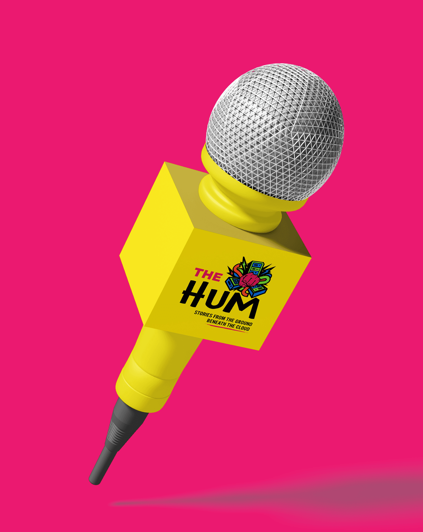
Yellow cube microphone on a pink background with The Hum logo and a pink fist illustration.

The mark on a microphone cube. We drew it to work as an object, not only as a square in a feed.
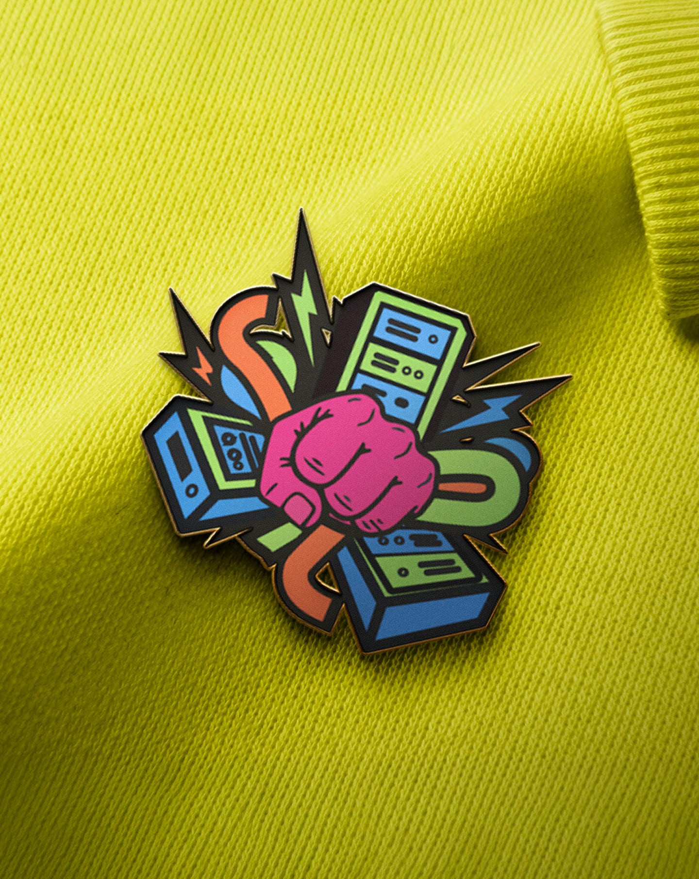
Enamel pin of a pink fist among computer servers and lightning bolts, on a yellow sweatshirt.

An enamel pin of the fist and servers mark, for listeners who wear what they listen to.
More projects

More projects

FAQ

Get quick answers about working with us and our approach to digital solutions.

What’s included in a monthly retainer?

01

Each retainer includes a set number of design or strategy requests per month, priority turnaround, and a dedicated point of contact. It’s built for teams who want ongoing support without starting from scratch every time.

How many requests can I make per month?

02

We typically handle up to two active requests at a time, with new ones queued as they’re completed. Most deliverables are turned around within 48–72 hours, depending on complexity.

Is a retainer better than a one-off project?

03

If you need ongoing design support, faster turnarounds, or regular iterations, a retainer is often more cost-effective and collaborative than starting fresh each time.

Who will I be working with?

04

You’ll work directly with senior designers and strategists. No middle layers, no fluff—just experienced people doing the work.

Do you work with international clients?

05

Yes. Most of our clients are remote. We’re fully set up to collaborate across time zones with clear communication and shared tools.

Let's talk

hello@creativecycle.io

2303 Cavendish Drive, Alexandria, VA 22308

Virginia

Make it happen

Let's talk

hello@creativecycle.io

2303 Cavendish Drive, Alexandria, VA 22308

Virginia

Make it happen

Let's talk

hello@creativecycle.io

2303 Cavendish Drive, Alexandria, VA 22308

Virginia

Make it happen