People Power Publishers

Client: Center for Nonviolent Conflict Research

Branding

Branding

Editorial Design

Editorial Design

Web Design

Web Design

Overview

The Center for Nonviolent Conflict Research studies how ordinary people win rights without violence. Its books are often written by the people who lived those movements. For about a decade, CNCR published them as ICNC Press, under one institutional template. We gave the press a new name, People Power Publishers, and a new identity. We also designed a cover system that lets each book look like its own story, and built a website around the catalog.

Team

Portrait of Carlos Murguia

Co-Creative Director

Carlos Murguia

Portrait of Jose Caicedo

Co-Creative Director

Jose Caicedo

Art Director

Barbara Condemarín

Art Director

Eli Taipe

Motion Designer

Mihail Mansilla

Deliverables

Naming

Brand identity

Book cover system

Website design and development
01

Challenge

One template for every movement

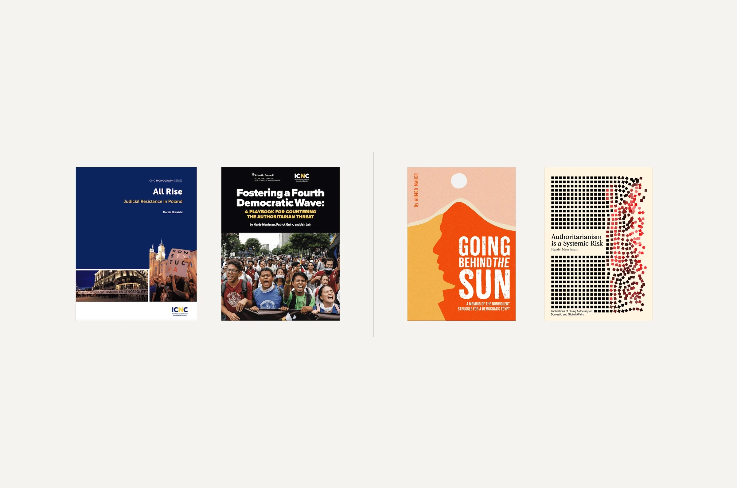
Every book went out with the same navy cover: a series label on top, the logo at the bottom, and a strip of photos. A hunger strike in Palestine, judicial resistance in Poland and young organizers in Zambia all looked like the same document. For a press whose authors tell their own stories, that sameness flattened the very people it wanted to be heard.

01

Challenge

One template for every movement

Every book went out with the same navy cover: a series label on top, the logo at the bottom, and a strip of photos. A hunger strike in Palestine, judicial resistance in Poland and young organizers in Zambia all looked like the same document. For a press whose authors tell their own stories, that sameness flattened the very people it wanted to be heard.

Two navy ICNC Press covers, All Rise and Fostering a Fourth Democratic Wave, beside two new PPP covers.

Before and after: the old ICNC Press template next to two covers we made to take after their own books.

02

Solution

Let the story set the form

The new name puts the subject first, and the mark is a set of overlapping letters, one form made of several. Each cover now comes from its own book. The first four range from a memoir of the Egyptian revolution to an essay on authoritarian risk, and nothing on them says which series they belong to. The website follows the same idea: the catalog skips series and opens four ways in, by format, topic, region and country.

02

Solution

Let the story set the form

The new name puts the subject first, and the mark is a set of overlapping letters, one form made of several. Each cover now comes from its own book. The first four range from a memoir of the Egyptian revolution to an essay on authoritarian risk, and nothing on them says which series they belong to. The website follows the same idea: the catalog skips series and opens four ways in, by format, topic, region and country.

People Power Publishers covers: Soup Throwers and Super Gluers in orange duotone, and Deciders, illustrated.

Two more covers from the system we built. One is a duotone photograph, the other an illustration, both clearly from the same house.
03

Impact

A press that looks like its authors

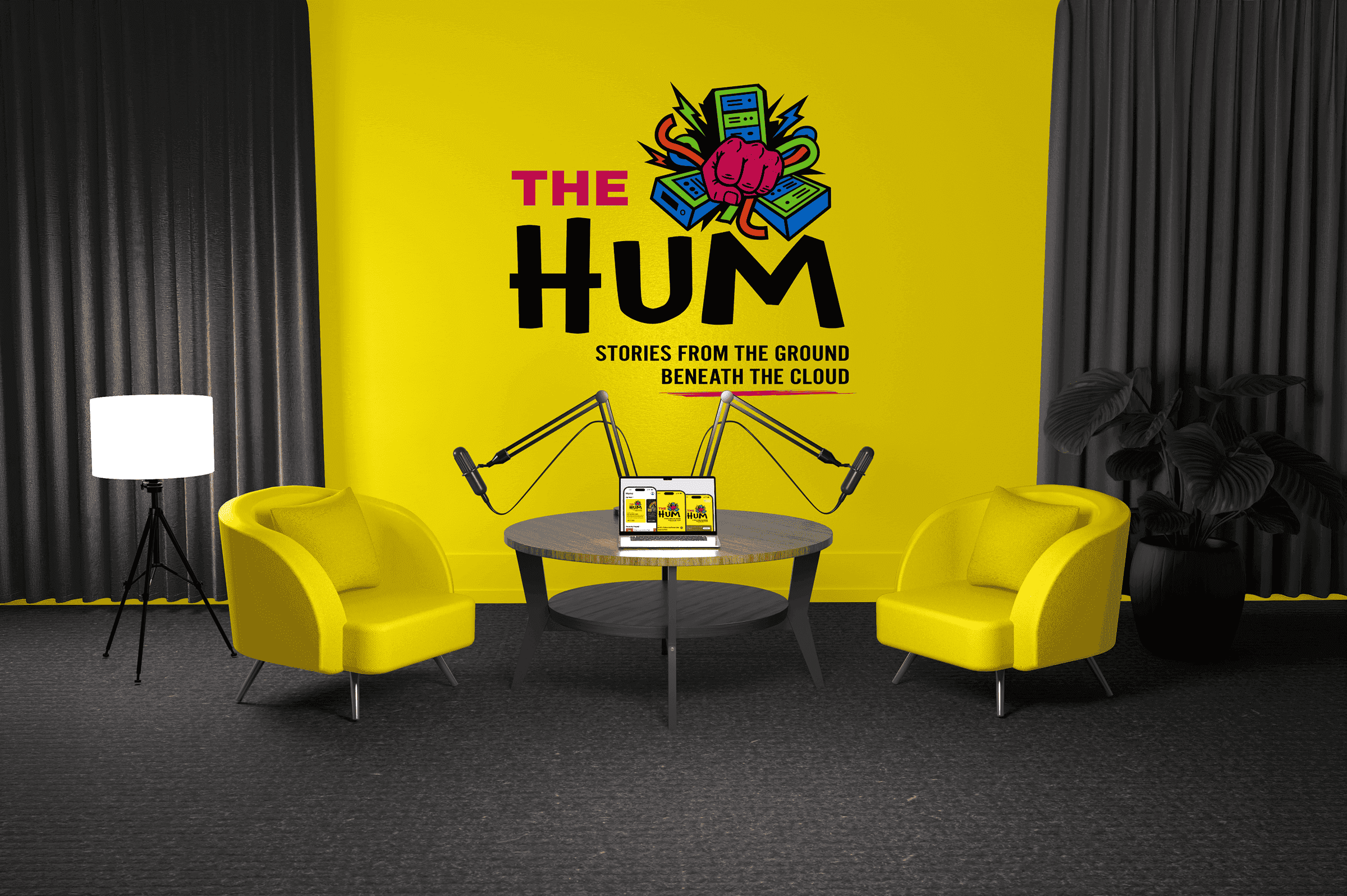
People Power Publishers launched with a new name, a new identity, four new covers and a website built around its catalog. The cover system keeps working as new titles arrive. Readers can still download every book for free, from a catalog of 38 titles from more than 80 countries. For the same client, we also named and branded The Hum, CNCR’s podcast about data centers.

03

Impact

A press that looks like its authors

People Power Publishers launched with a new name, a new identity, four new covers and a website built around its catalog. The cover system keeps working as new titles arrive. Readers can still download every book for free, from a catalog of 38 titles from more than 80 countries. For the same client, we also named and branded The Hum, CNCR’s podcast about data centers.

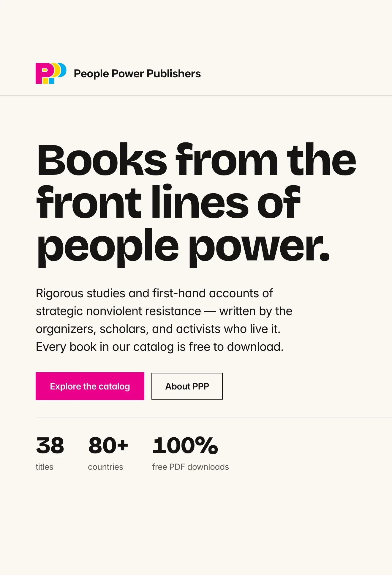
People Power Publishers home page with the headline

The home page we designed and built, with the logo, the promise, and a short path into the free catalog.

Three catalog book covers stacked over a yellow circle and a cyan block on the site's home page.

On the home page, catalog covers stack over the yellow sun and cyan base of the four-ink palette.
More projects

More projects

FAQ

Get quick answers about working with us and our approach to digital solutions.

What’s included in a monthly retainer?

01

Each retainer includes a set number of design or strategy requests per month, priority turnaround, and a dedicated point of contact. It’s built for teams who want ongoing support without starting from scratch every time.

How many requests can I make per month?

02

We typically handle up to two active requests at a time, with new ones queued as they’re completed. Most deliverables are turned around within 48–72 hours, depending on complexity.

Is a retainer better than a one-off project?

03

If you need ongoing design support, faster turnarounds, or regular iterations, a retainer is often more cost-effective and collaborative than starting fresh each time.

Who will I be working with?

04

You’ll work directly with senior designers and strategists. No middle layers, no fluff—just experienced people doing the work.

Do you work with international clients?

05

Yes. Most of our clients are remote. We’re fully set up to collaborate across time zones with clear communication and shared tools.

Let's talk

hello@creativecycle.io

2303 Cavendish Drive, Alexandria, VA 22308

Virginia

Make it happen

Let's talk

hello@creativecycle.io

2303 Cavendish Drive, Alexandria, VA 22308

Virginia

Make it happen

Let's talk

hello@creativecycle.io

2303 Cavendish Drive, Alexandria, VA 22308

Virginia

Make it happen