The 5 Most Common Website Mistakes Small Businesses Make
Small business web design
website mistakes to avoid
homemade design strategy

Eli Taipe
UI/UX Specialist

⊹
When you're running a small business, your website has to work harder.
It is your front door, it is your elevator pitch, and it's most likely a far better salesperson than even the best person you can hire — particularly if you don't have an enormous marketing budget.
That's why little mistakes can have vast repercussions.
We've encountered numerous websites with the best intentions, but good intentions alone don't convert leads or inspire trust.
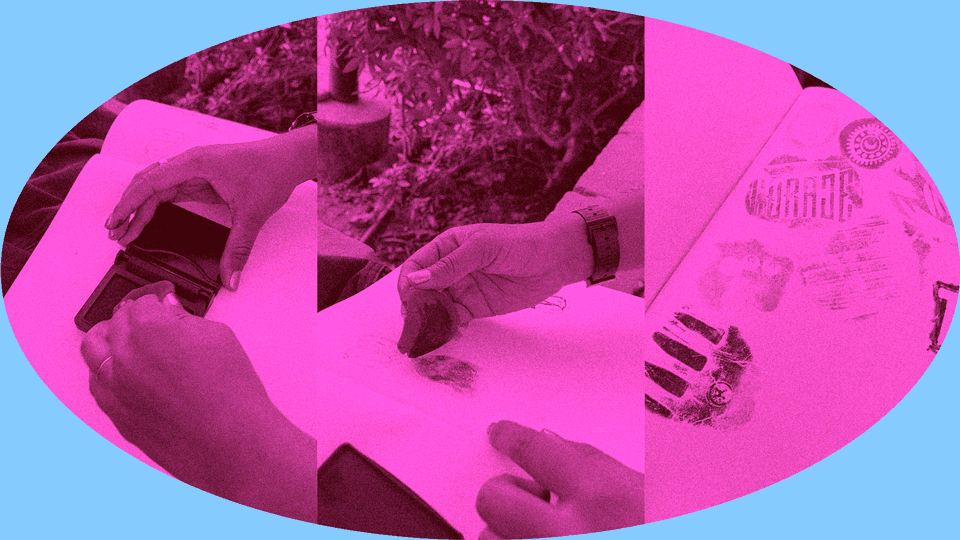
When you make all your products by hand, design isn't just about what looks good—it's also the care (and clarity) that goes into crafting each piece and a deep knowledge of what customers want.
Here are the five biggest mistakes we see (and how to avoid them):
Saying Too Much, Too Soon
The error: Including everything about your business on your homepage.
Why it matters: Visitors make a snap decision in seconds about whether they're going to stick around or bounce. If they encounter long paragraphs of text with no clear path, they will bounce.
What to do instead: Open with purpose. What do you offer? Who is it for? What's the next step? A simple design with a clear headline and a prominent call-to-action is often more effective than the most well-written long-form copy — at least above the fold.
No Clear Call to Action
The error: Burying the CTA — or not having one at all.
Why it matters: If you do not ask anything from your visitors, they will give nothing in return. A good CTA takes a voyeuristic audience and turns them into active participants.
What to do instead: Replace those buttons with ones that announce exactly what's going on, like Book a Call, Get a Quote, or Try It Free. Place them where they make the most sense: top navigation, mid-scroll, and end-of-page.
Designing for Yourself, Not Your User
The mistake: Building a site that serves your tastes, rather than those of your audience.
Why it matters: You don't have a website that is a portfolio; you have one that's operational. I believe that such design details should guide users rather than merely impress them.
What to do instead: Prioritize the user from day one. Why are they visiting? What problem are they attempting to solve? Design the site to make that inevitable journey intuitive, frictionless, and gratifying. To design something homemade is to put empathy before ego.
Forgetting Mobile
The mistake: Treating mobile as an afterthought or using a clunky template that doesn't scale.
Why it matters: More than half of your users will probably come on their phones. A bad customer experience on mobile is instant credibility death.
What to do instead: Mobile-first design. Please don't make me think, tighten up the content, and try it on a few devices. A good responsive design doesn't simply "shrink down"— it adapts.
Skipping the Strategy
The error: Building a website with no regard to content flow, SEO, and conversion paths.
Where it stands: A pretty site without strategy is like a brochure no one picks up. If you don't have a plan, you won't get either traffic or sales.
What to do otherwise: Begin with the goal. Whether you're talking about bookings, signups, or sales, everything should ladder up to that result. Then you build content, design, and functionality around that.
Final Thought: Homemade, Not Half-Baked
At Creative Cycle, we think great design should feel transparent. Your users should not be thinking about buttons or fonts — they should instead feel directed, at home, and understood. That's the power of a website that is built with purpose.
Small Businesses Don't Need Big Agencies. They need closer ones.
👋 Want help with your site — or building one from scratch? Let's talk. We are a small team that designs websites with soul and function. No fluff. Just a homemade design that works.
Share This Article